Lumora

Redesigning a mobile experience to help users track emotions and seek support with ease

Project Header

Project Overview

The Challenge

A mental wellness app designed to help users log their emotions, monitor their mental health patterns, and access support resources was underperforming due to usability challenges. We redesigned the experience to be emotionally intuitive, visually calm, and action-driven - supporting users in vulnerable moments.

Outcome

  • +60% faster task completion across all 3 flows
  • +40 Net Promoter Score increase in test feedback
  • 9/10 users preferred redesigned version and said it felt “more human”

The Problem

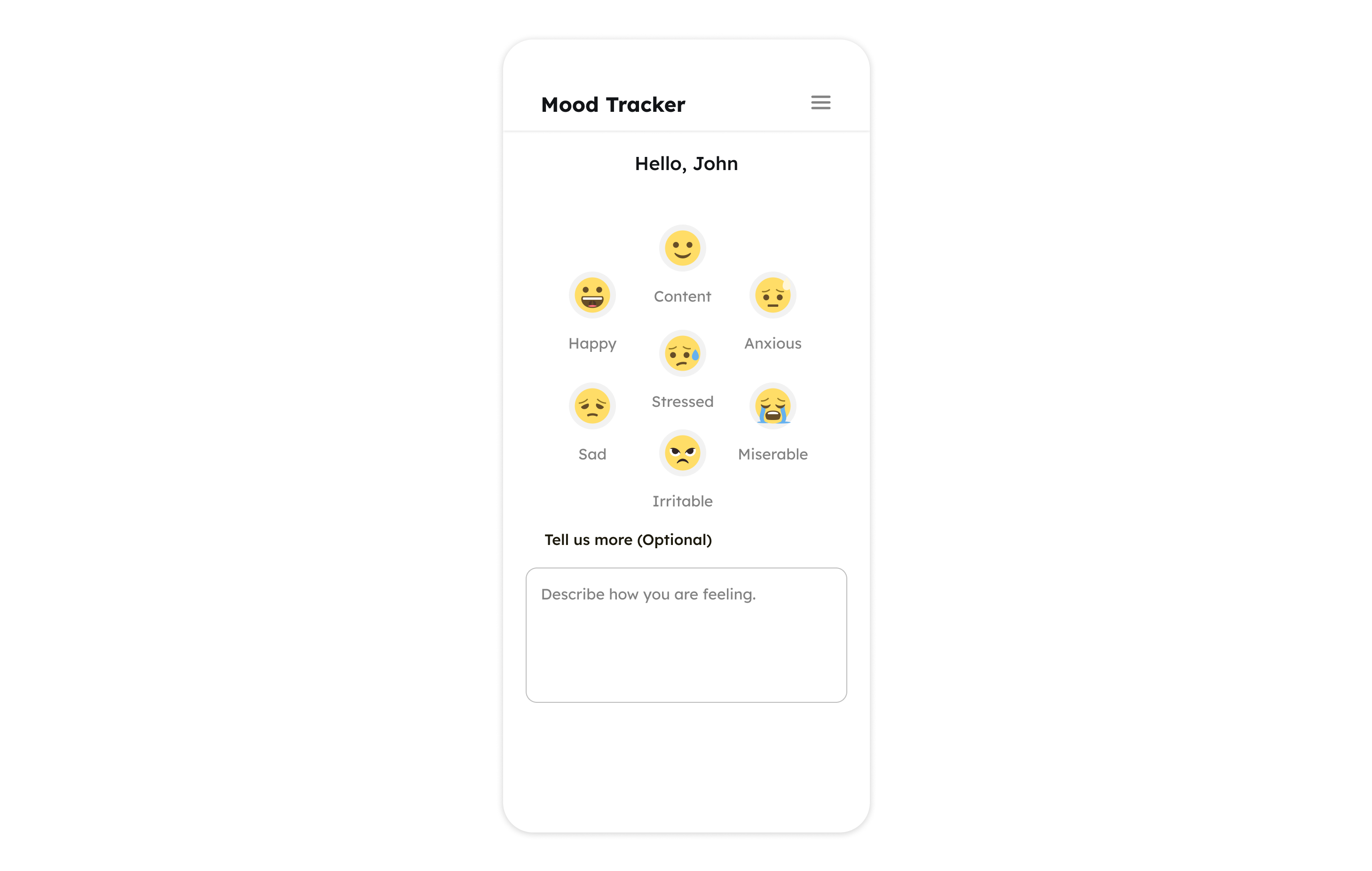
Despite having valuable features, the original app created cognitive friction during key emotional tasks.

Key UX Issues Identified:
Emotion Logging Was Overwhelming
The original mood tracker presented 8 facial expressions with similar styling, making it hard for users to quickly identify and select how they felt — especially during emotional lows.
Reports Lacked Clarity and Readability
The line chart used to track emotional trends was visually cluttered and difficult to interpret, particularly for non-technical users. Emotional states and progress were not easily scannable at a glance.
Support Access Was Passive and Disorganized
In the Help section, users were expected to describe their mental state before accessing help, and support resources were listed without prioritization or urgency — not ideal in moments of distress.
The interface was cluttered and hard to use during emotional moments.

Mood Tracker Simplified

Before

before

  • Too many emotion options
  • No visual emphasis or clear selection state
  • Emotion selection felt clinical and detached
After

after

  • Reduced number of moods to key, recognizable states
  • Used larger, friendly emoji with strong visual feedback
  • Added personalization ("Hi John!") for warmth
  • Clear CTA: “Note Mood” encourages completion
3x
Faster mood logging
(avg 2.8s vs 8.5s in original)
Insight
Users found the new flow more intuitive and less stressful during emotional lows.

Reports Made Readable

Before

before

  • Cluttered line graph
  • Lack of emotional mapping with data points
  • Low visual hierarchy
After

after

  • Replaced with an emotionally-mapped bar graph
  • Included mood icons under each day for better connection
  • Visual storytelling: Emotions now matched with actual days
  • Added time filters (Day, Week, Month, Year) for data control
87%
Testers found reports easier
42% longer engagement in Reports screen
Insight
Users spent 42% longer in the Reports screen post-redesign - showing deeper engagement

Help Section Redesigned for Real Needs

Before

before

  • Cluttered line graph
  • Lack of emotional mapping with data points
  • Low visual hierarchy
After

after

  • Immediate mood-based tag selection (e.g., Stress, Anxiety)
  • Optional input — not mandatory
  • Support section folded in neatly with expandable hierarchy
  • Call-to-action first, feelings second — removing friction
2 taps
To access support
vs 5+ in the original
Insight
“I’d use this in real life, especially when I can’t type how I’m feeling.”

Redesigned screens

Redesigned Screens

Mood Tracker

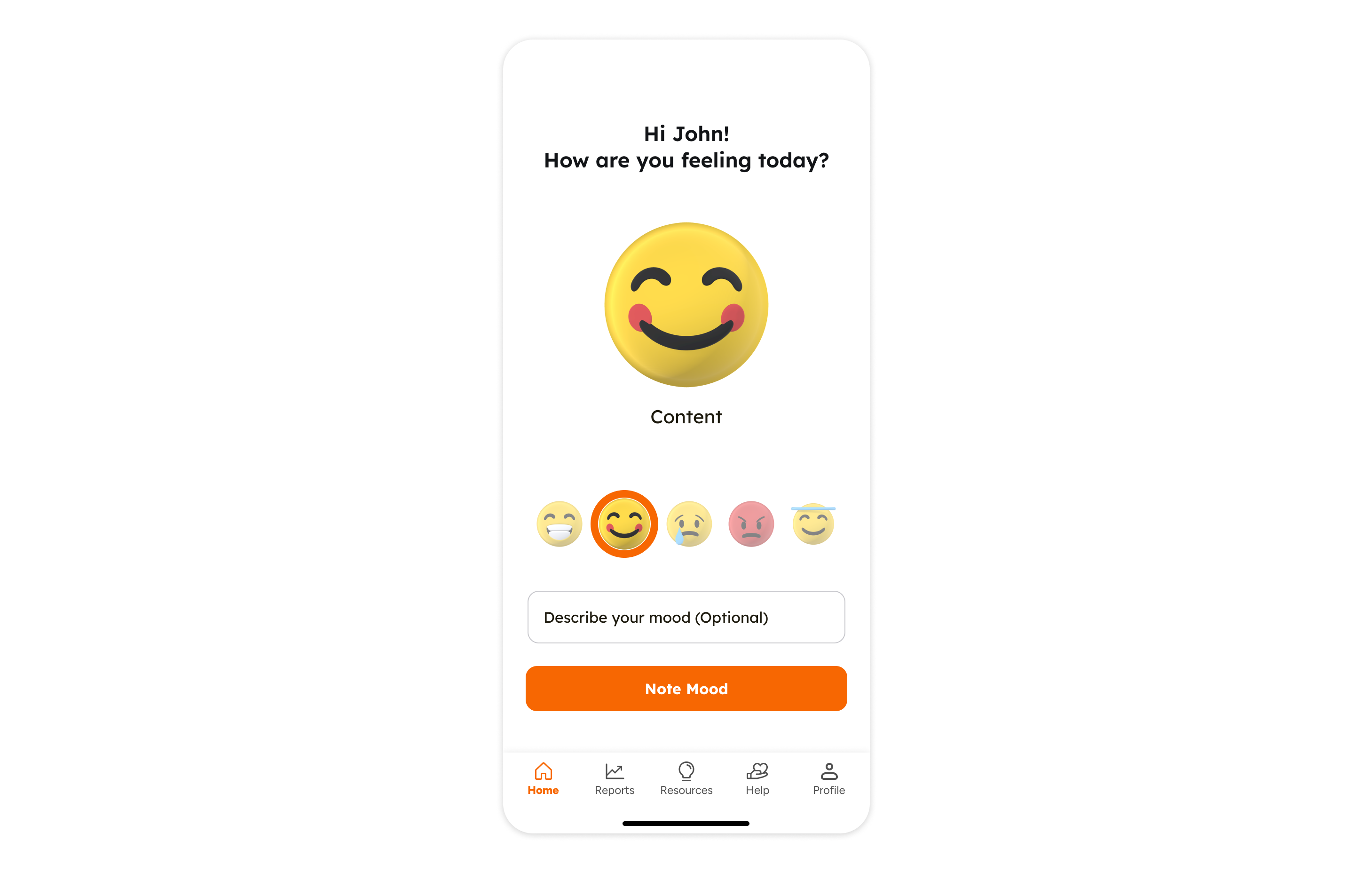
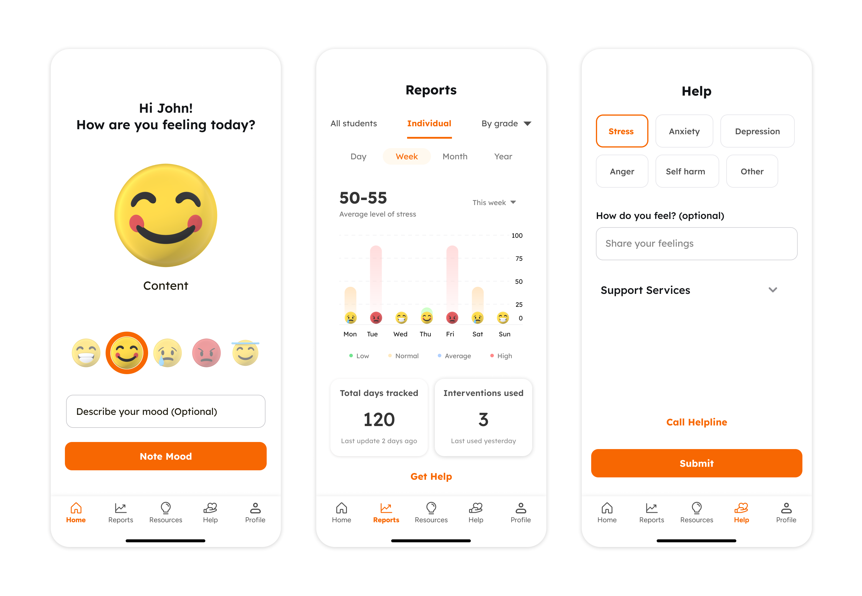
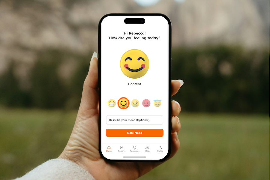
Simplified emotion logging with clear visual feedback and friendly interface.

Reports

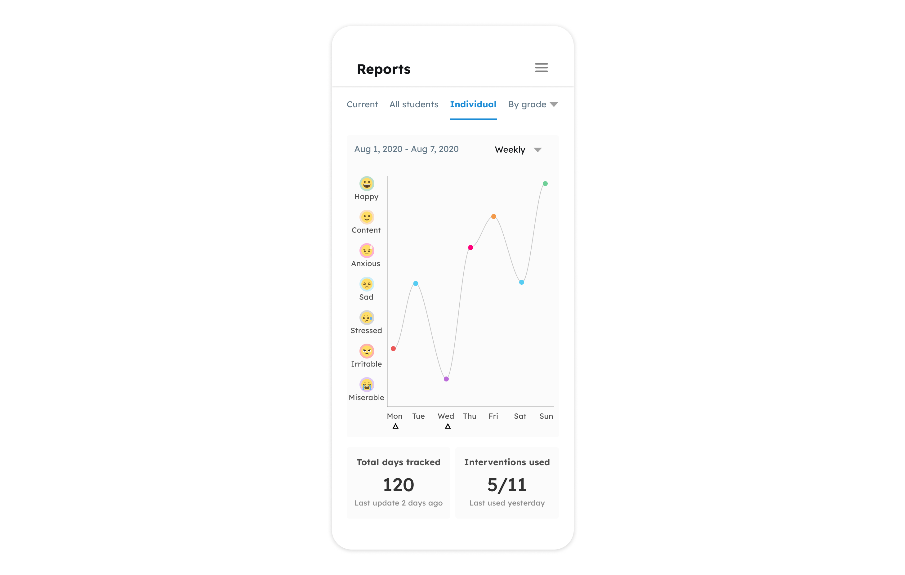
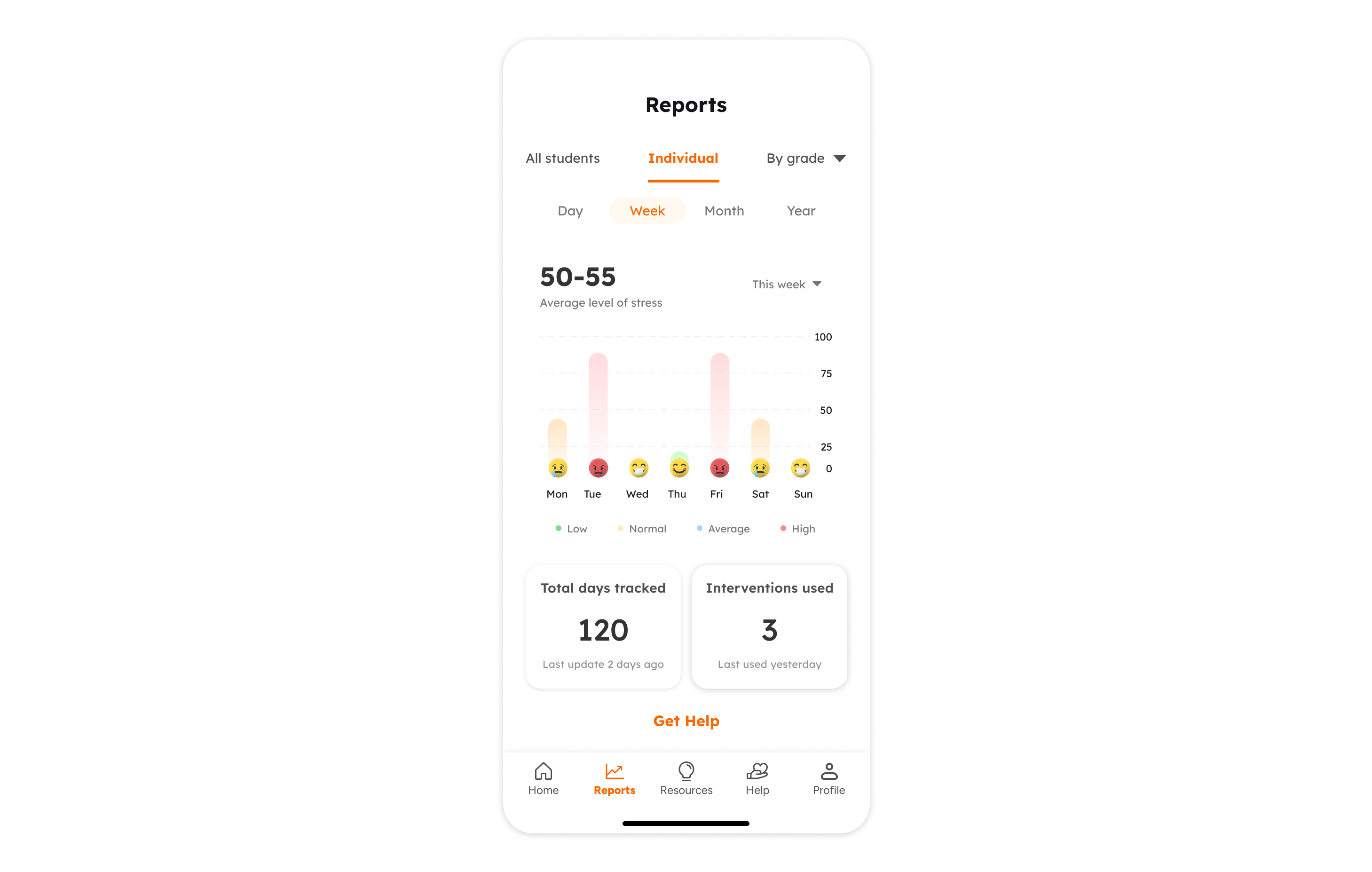
Intuitive visualization of emotional patterns with easy-to-read bar graphs.

Help

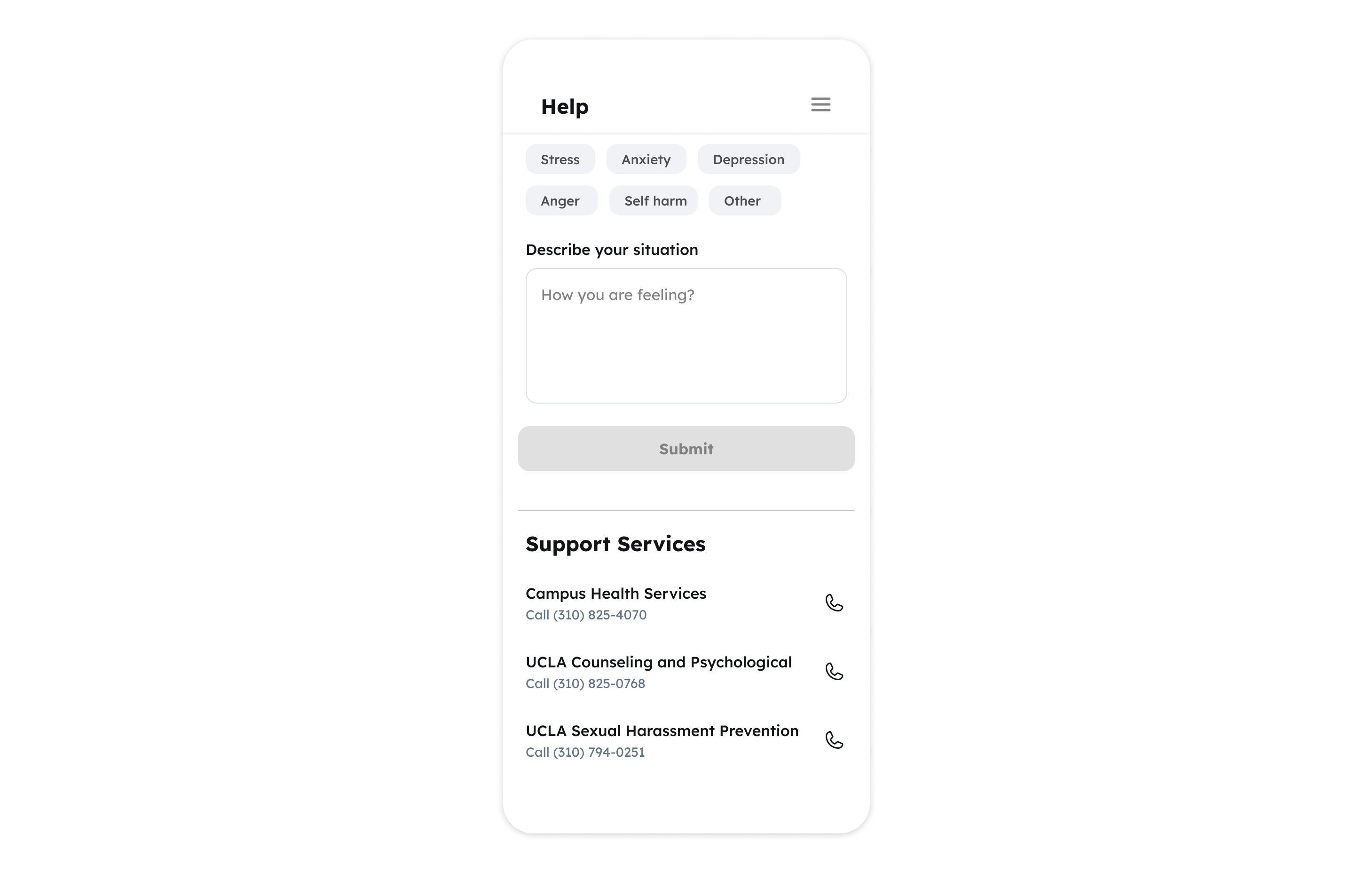
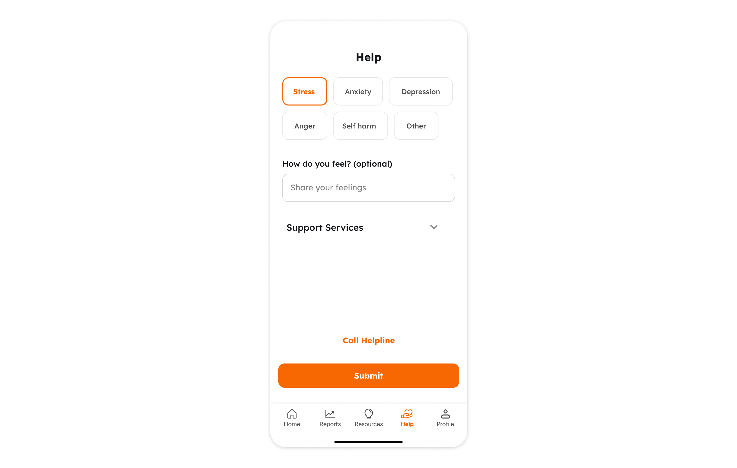
Quick access to support resources with streamlined navigation and minimal friction.

Designing for emotion is a responsibility

Learnings

the best UX isn’t just usable - it’s emotionally aware

Tools used:

Figma · Maze · FigJam

Role:

UX Research · Interaction Design · Visual UI Design

Want to create intuitive experiences for real human needs?

Let's work together.